My Own Volition
Empowering Decision Making for Disabled Communities with the Volition App
My Role: Brand Identity Design, UX Research & Testing, UX/UI Design
Credits: Erika B (CEO/Founder/Researcher), Neville P (Chief Advisor), Fabian Cook (Solutions Architect), Better Day Productions (PledgeMe Video)
Every day, people in our disabled communities and in assisted care, face obstacles to exercising the basic human right to make their own choices. Volition is on a mission to break down these barriers and empower everyone to be a decision maker.
The Volition app, the first of its kind, is a collaborative tool that captures individuals' preferences to enhance assisted decision-making and ensure everyone has autonomy over their decisions.

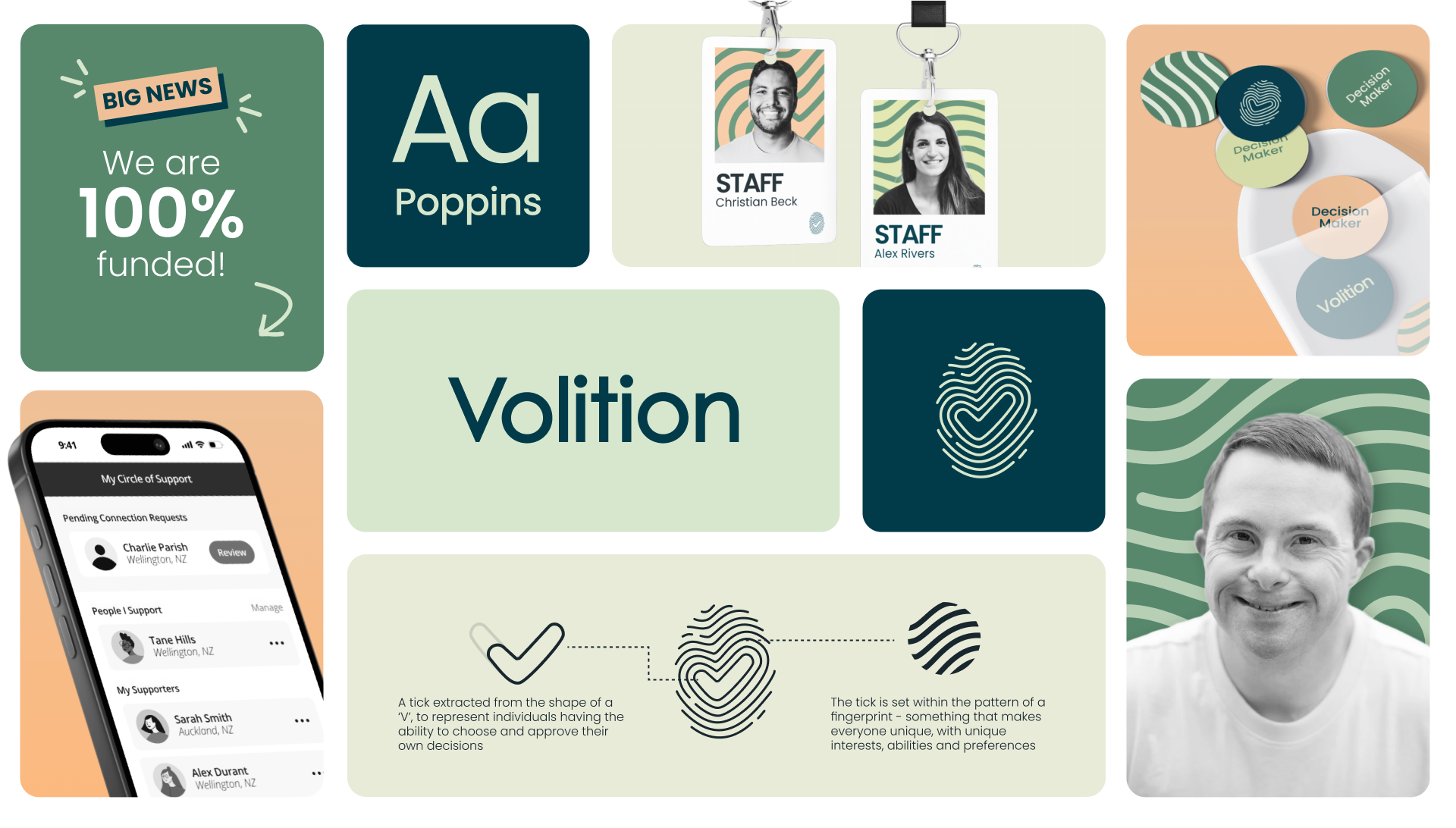
Brand Identity Refresh
Erika, Volition’s founder, approached me to refresh the brand identity, and improve the app’s user experience. The new logo aimed to embody empowerment and individuality, complimented by a modern and accessible typeface, and a natural, inviting colour palette.
Volition App Redesign
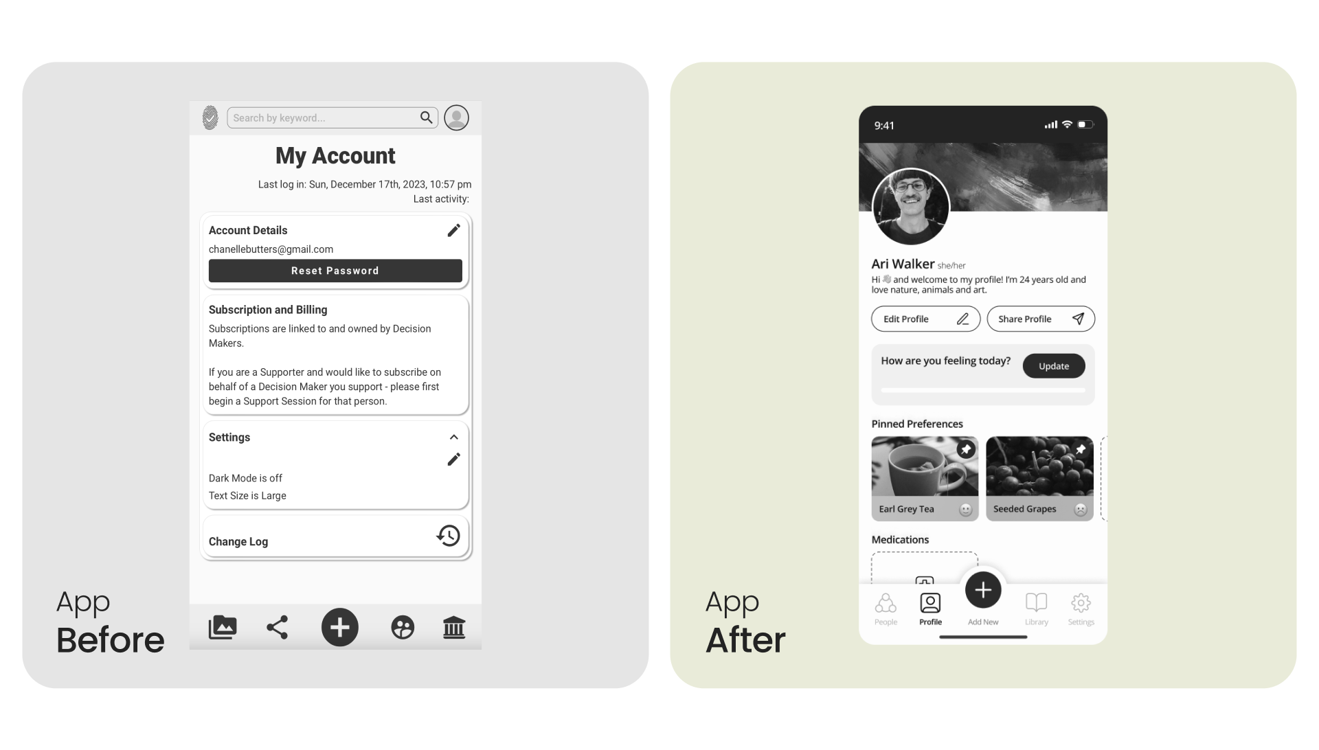
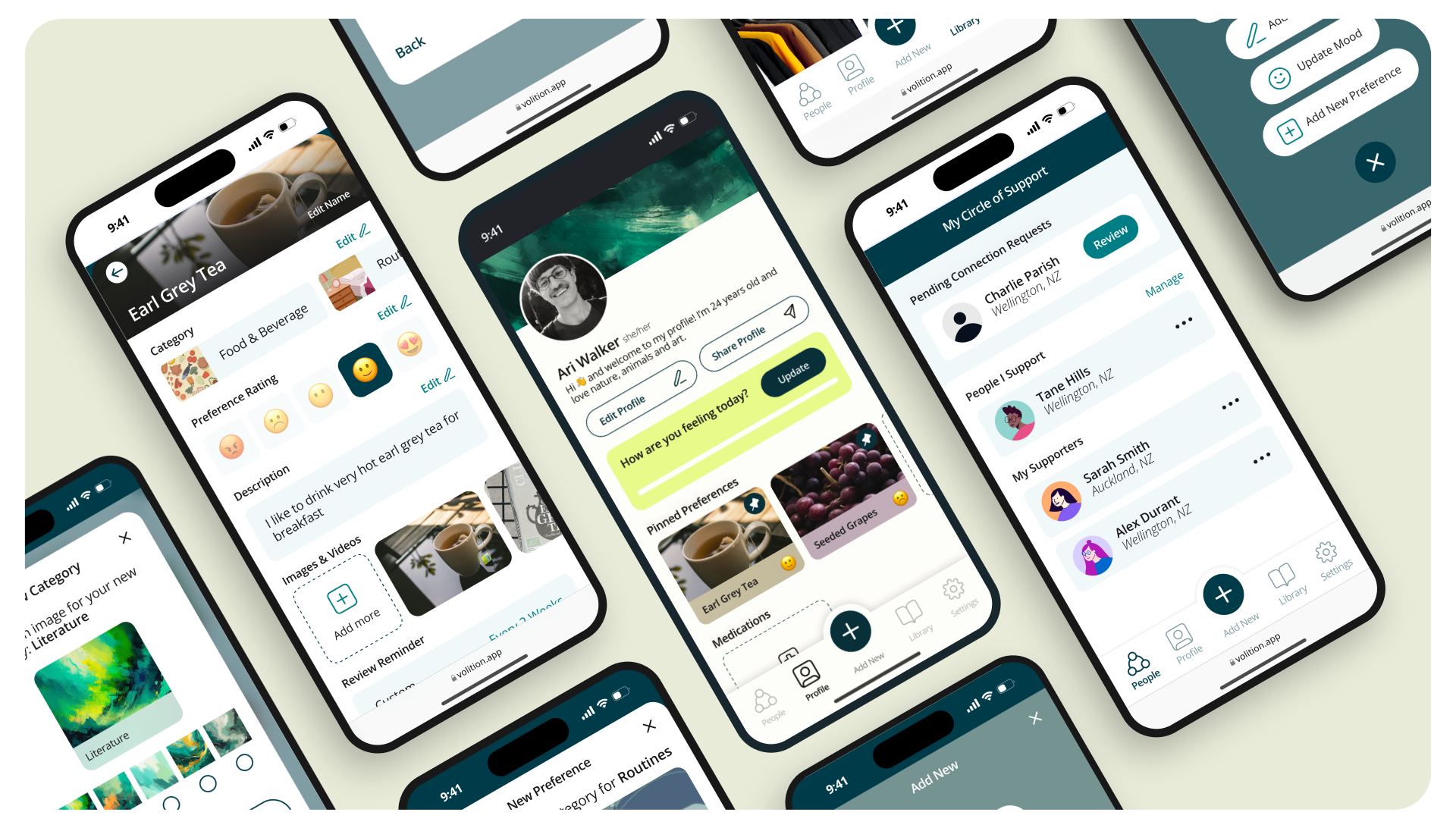
The Volition app redesign was a comprehensive effort aimed at transforming the user experience for both decision-makers and their supporters. As a platform designed to empower individuals to take control of their preferences and well-being, the goal was to create an intuitive, accessible app that simplifies complex interactions while reducing the mental load on users. Through extensive user research, empathy mapping, and iterative design, we sought to streamline the onboarding process, enhance navigation, introduce unique profile customisation and ensure that preferences could be easily logged, shared, and updated.
Below is a detailed look at each step in the process, reflecting the design process, from initial research and ideation to prototyping and final handoff, showcasing how design thinking methodologies were applied to address the unique needs of both abled and disabled users; decision-makers and supporters.
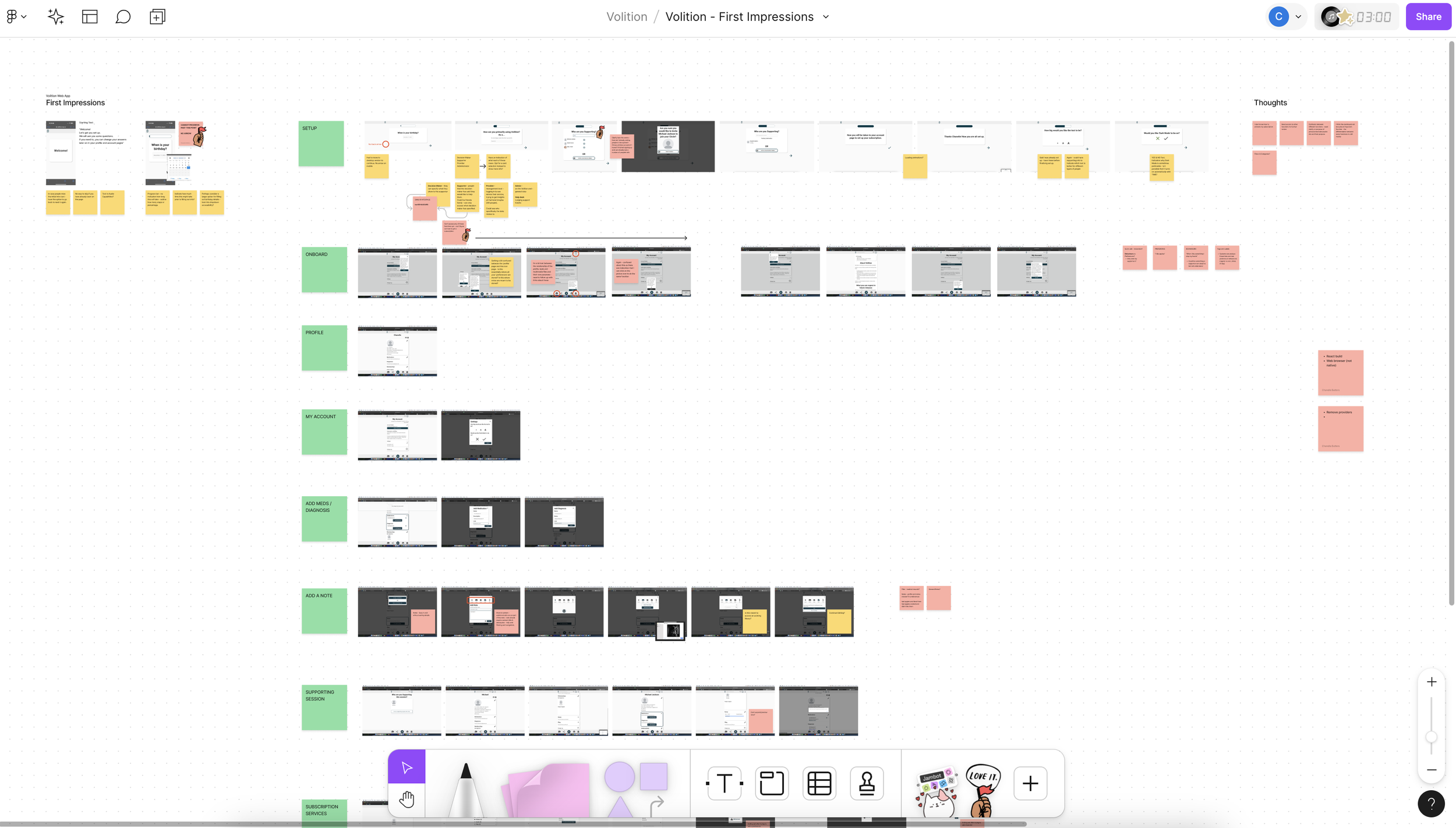
First Impressions & Analysis -> Before diving in, I always like to do some initial testing on my own to gather first impressions and gather current state experience insights. Some key findings included confusion during onboarding, with difficulties found in navigating to key sections like preferences and support circles, as well as a need for a clearer, more intuitive action button for adding preferences. This analysis set the foundation for next steps.
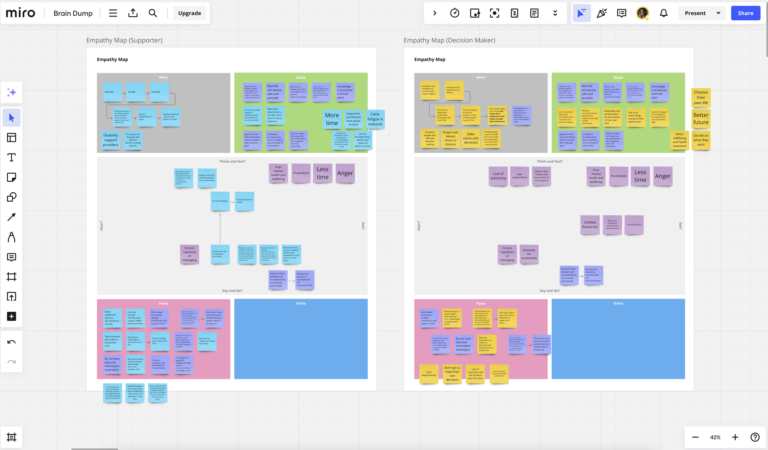
Empathy Mapping -> To dive into a deeper understand of our users, I created empathy maps for both decision-makers and supporters, outlining their thoughts, feelings, pains, and gains. Decision-makers expressed feelings of frustration due to limited autonomy and the mental load of constantly repeating preferences. Supporters, on the other hand, emphasised the challenge of balancing their own lives while ensuring the well-being of those they cared for. This insight led to the introduction of features such as a centralised profile page to add personalisation, streamline communication, and be a core touchpoint for viewing important information like medication and key preferences at a glance.
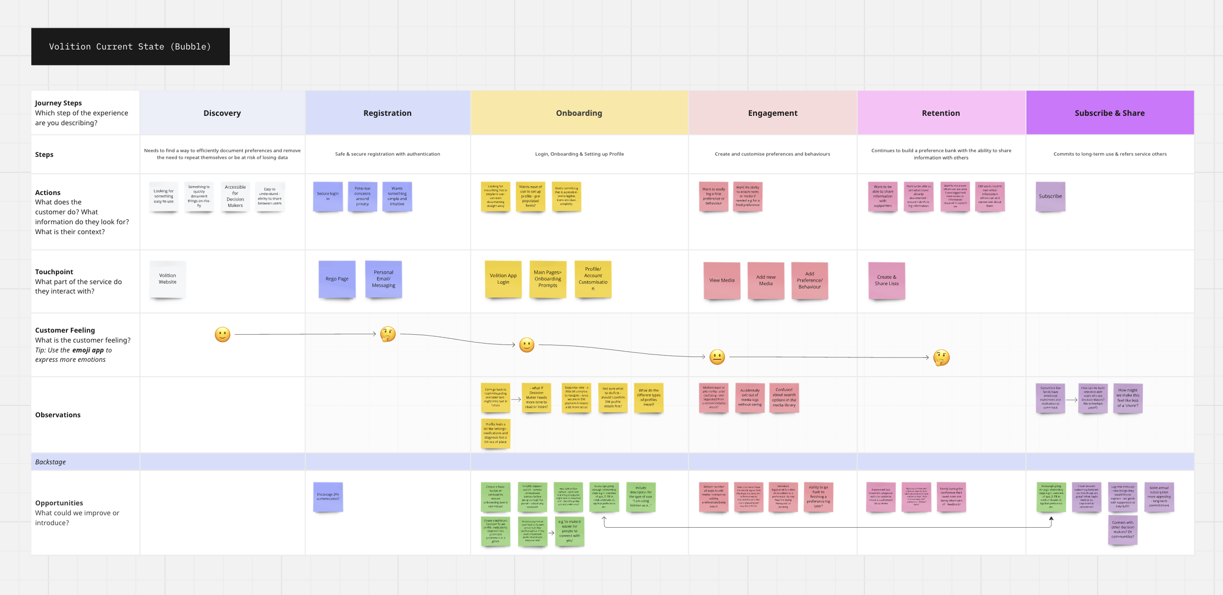
Customer Journey Mapping (Current State) -> The current state customer journey map revealed and validated friction in key areas and opportunities for improvement. Decision-makers struggled with customising their profiles, and the process of adding preferences was not intuitive. We mapped each step, from discovery through to engagement, to visualise where improvements could be made. This analysis directly informed further opportunity in improving the onboarding flow and profile customisation features, ensuring a smoother start for new users.
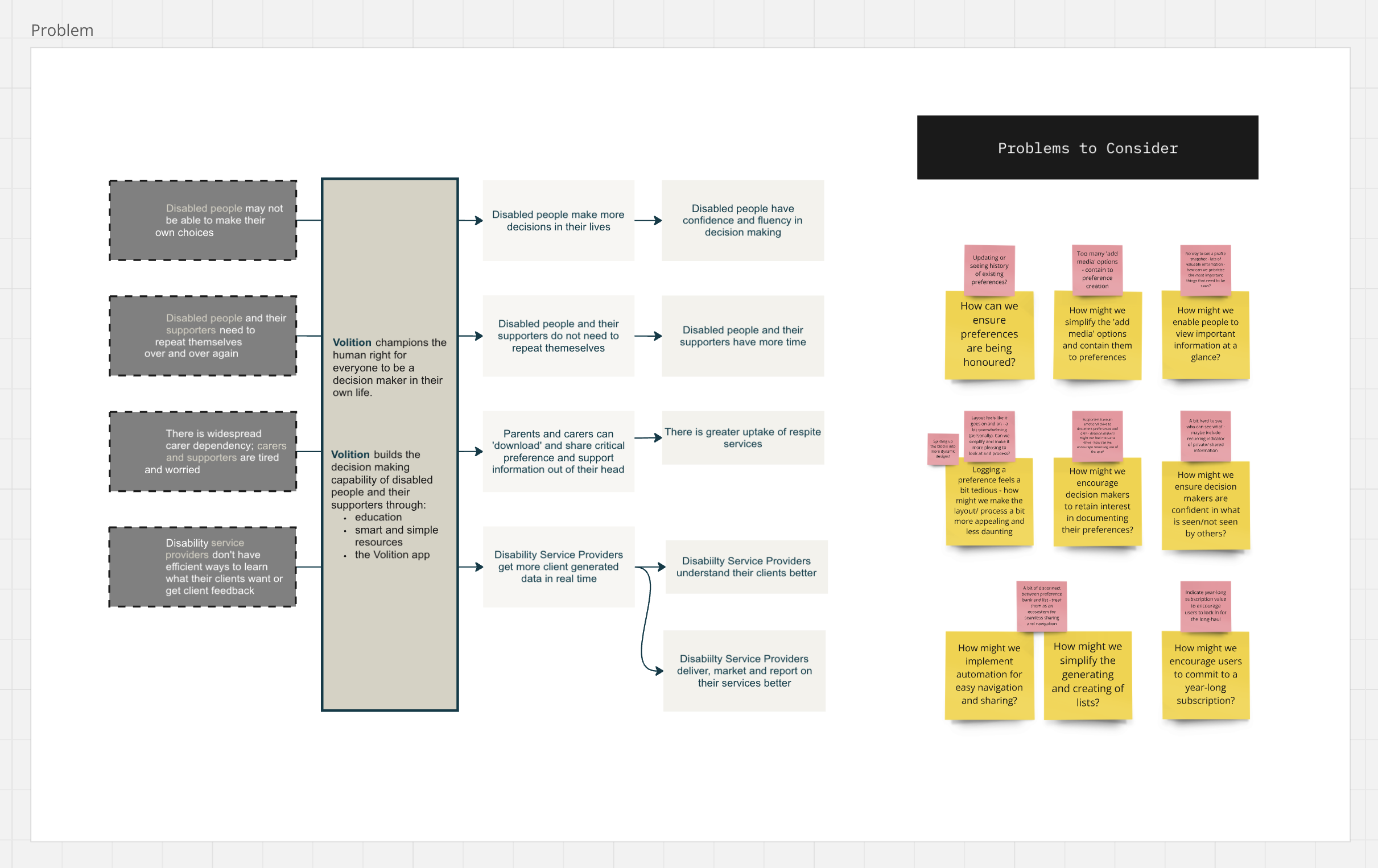
Problem Statements -> Based on research and journey mapping, we defined problem statements that clearly outlined the issues decision-makers and supporters faced. We identified new problems to consider when it came to user retention, personalised information, data privacy, sharing capabilities, cognitive overload and more. These problem statements became the focal points for our design strategy, guiding us to develop solutions that create a more streamlined, enjoyable and accessible experience.
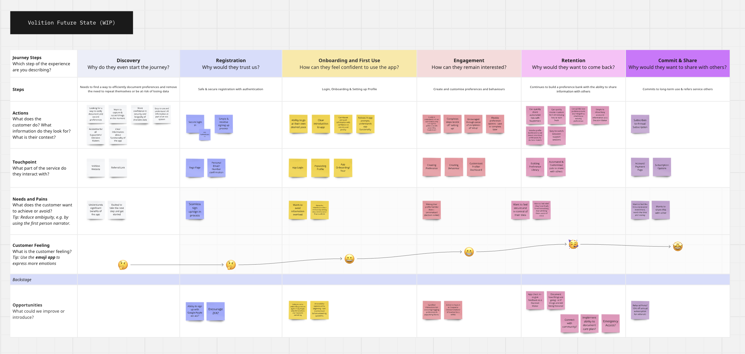
Customer Journey Mapping (Ideal State) -> The ideal state customer journey map reimagined the user experience from onboarding to retention, focusing on eliminating the friction points identified earlier. The goal was to make preference logging seamless and engaging, with clear prompts and a straightforward action button for adding new preferences. Onboarding was also reconsidered to provide users with a guided tour of the app’s features; as well as profile customisation to increase a sense of autonomy and identity within a digital environment.
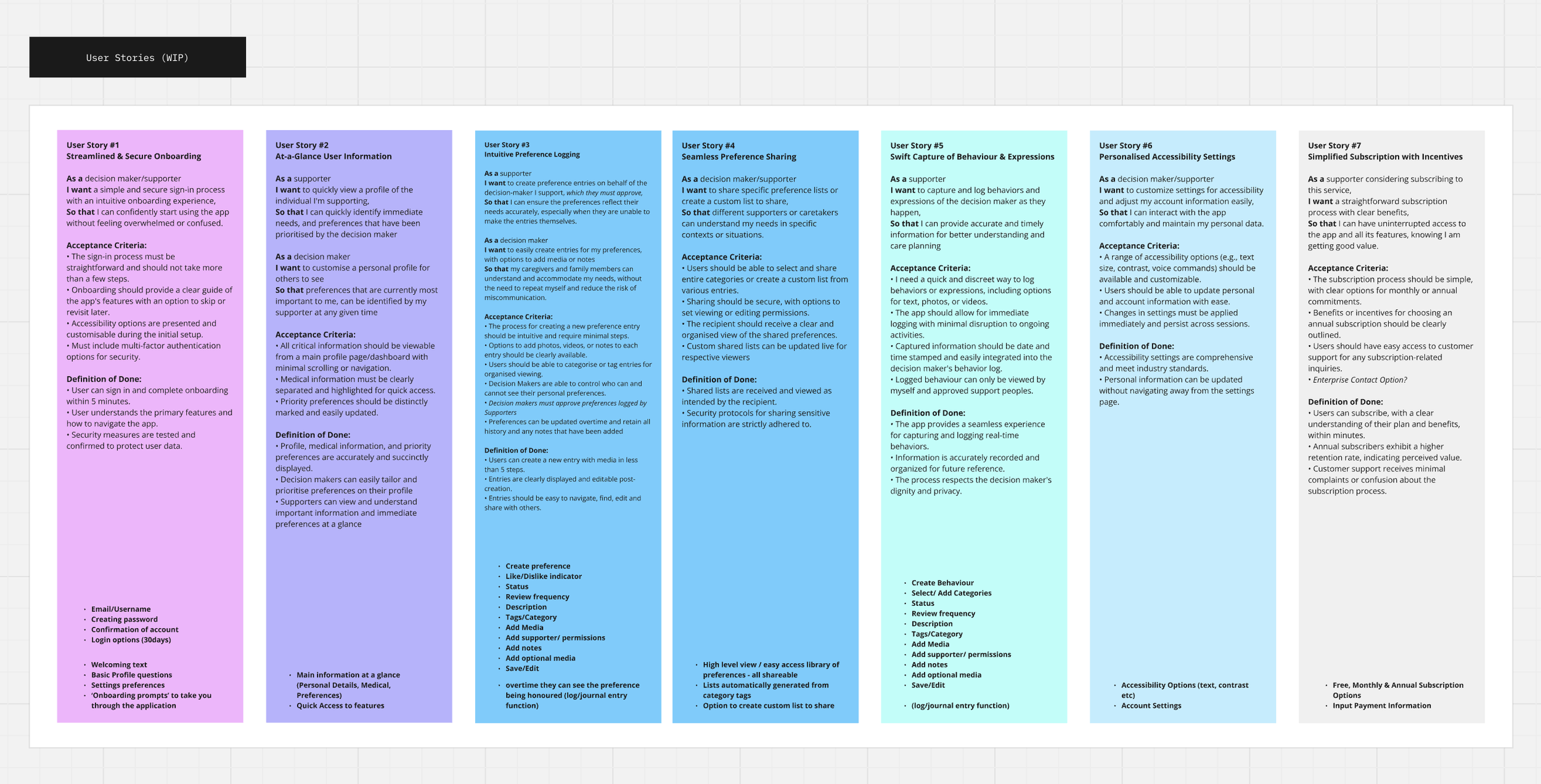
Problem Statements -> Now with defined problem statements, and a map of an ideal future state, I created a series of user stories that captured the essential tasks decision-makers and supporters needed to accomplish within the app. For example, "As a decision-maker, I want to customise a profile for my preferences so that my supporters can quickly understand my needs." These stories clearly outlined the reasoning behind the introduction new features for decision makers and supporters alike, and act as a guide to clarify whether or not these needs had been met through a detailed acceptance criteria and definition of done.
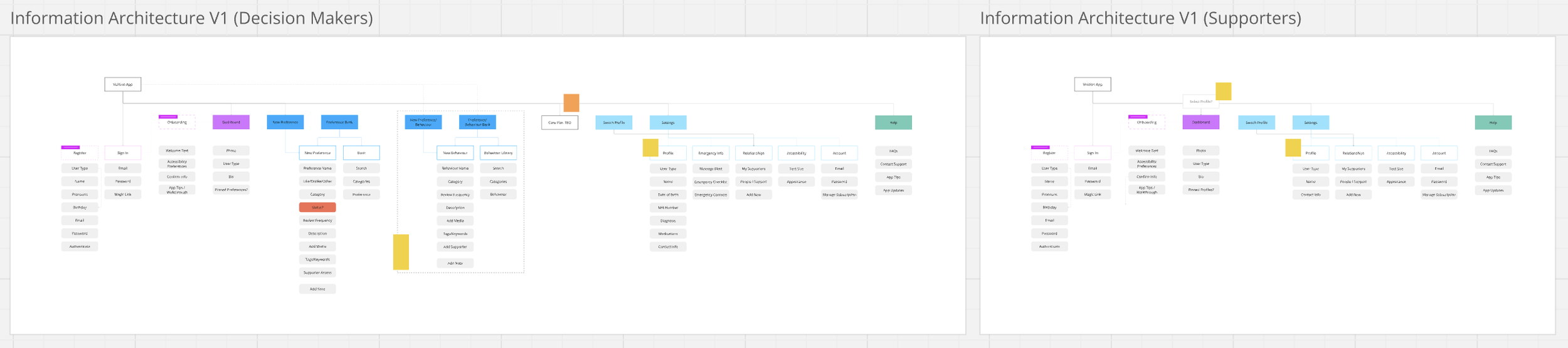
Information Architecture -> The information architecture was designed to create a logical structure for both decision-makers and supporters, ensuring that users can easily access the most important features and content. By organising the app’s components—such as profiles, preferences, support circles, and settings—into distinct, easy-to-navigate sections, we can find further opportunities to reduce cognitive load and make it clear for users to find what they need.
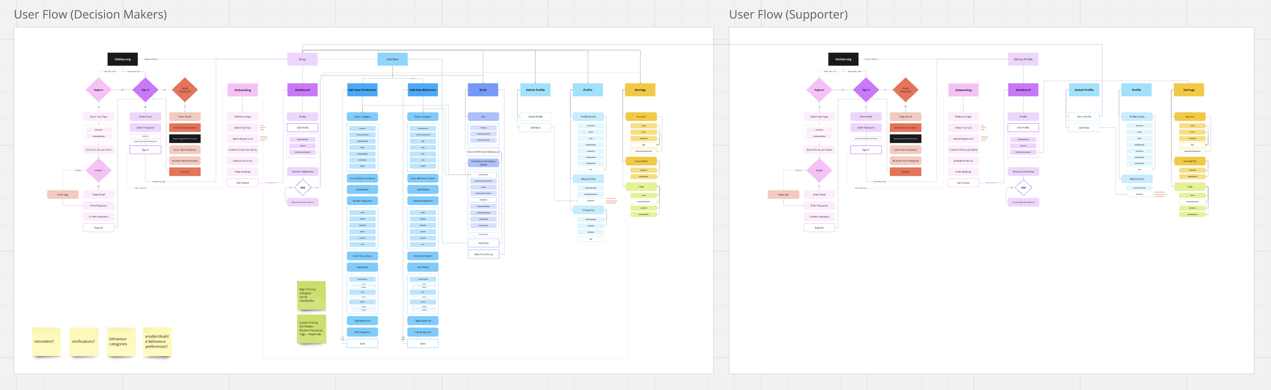
User Flows -> User flows were then created to map out every action a user can take, from signing in to updating preferences and interacting with supporters. These flows visualise how decision-makers and supporters navigate through key tasks, ensuring that each step in their journey is intuitive and friction-free. For example, the decision-maker flow starts with setting up a profile and moves through preference logging, while the supporter flow emphasises how to access, view, and support the decision-maker’s preferences.

Sketching & Lofi Wireframes -> These early digital wireframes allowed for rapid feedback and iteration, ensuring that the basic structure of the app met user needs before moving on to more detailed designs. (Not pictured - before this stage I always start with sketches on paper, using Crazy 8 methods to quickly ideate before moving into Figma).
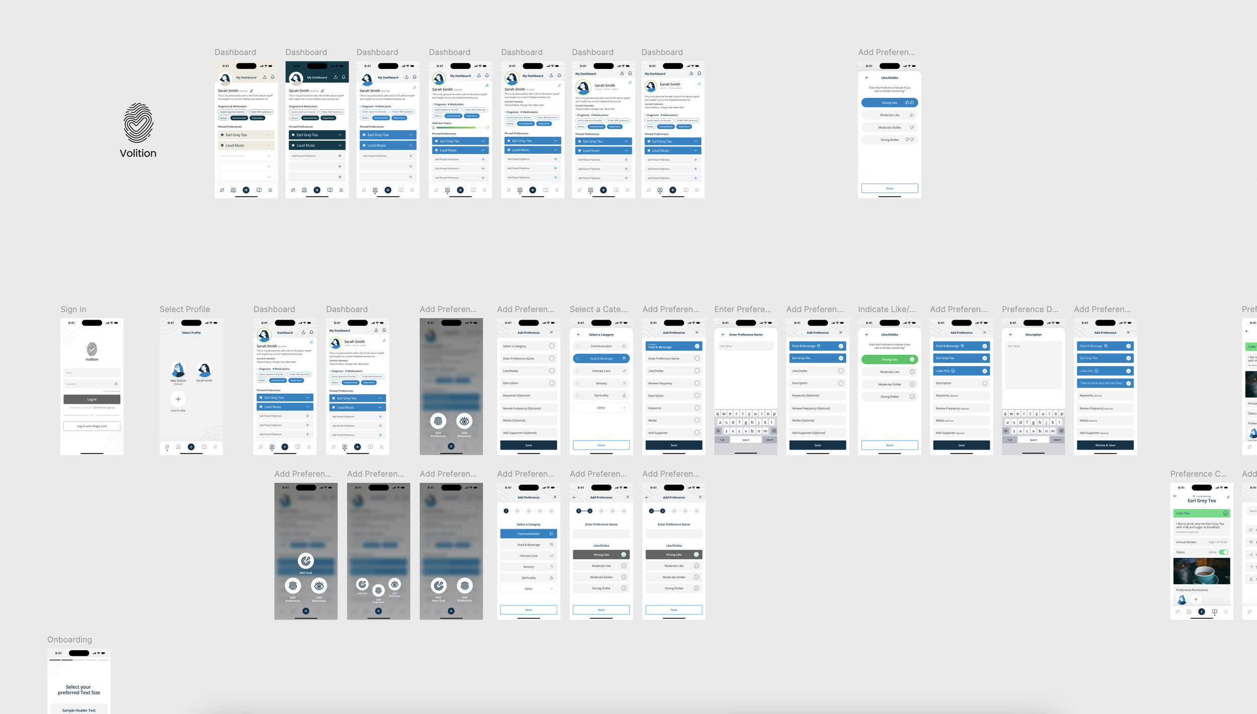
Hifi Wireframes -> Here I began to flesh out wireframes that incorporated more detailed UI elements and design components - an exciting phase where the vision is brought to life.

User Flow Diagrams -> From there I created initial user flow diagrams to break down each interaction point a user has within the app, showcasing the paths a decision-maker or supporter might take depending on their goals. These diagrams are key to ensuring that every possible user journey is accounted for, from a simple sign-in process to more complex actions like updating multiple preferences or managing a support circle. By creating user flows, I can ensure that users are never “stuck” and that each path leads them seamlessly to the next action or task. This was also a useful point to gain valuable feedback from stakeholders and find opportunities to iterate.

Hifi Wireframes & Prototype Iteration in Progress
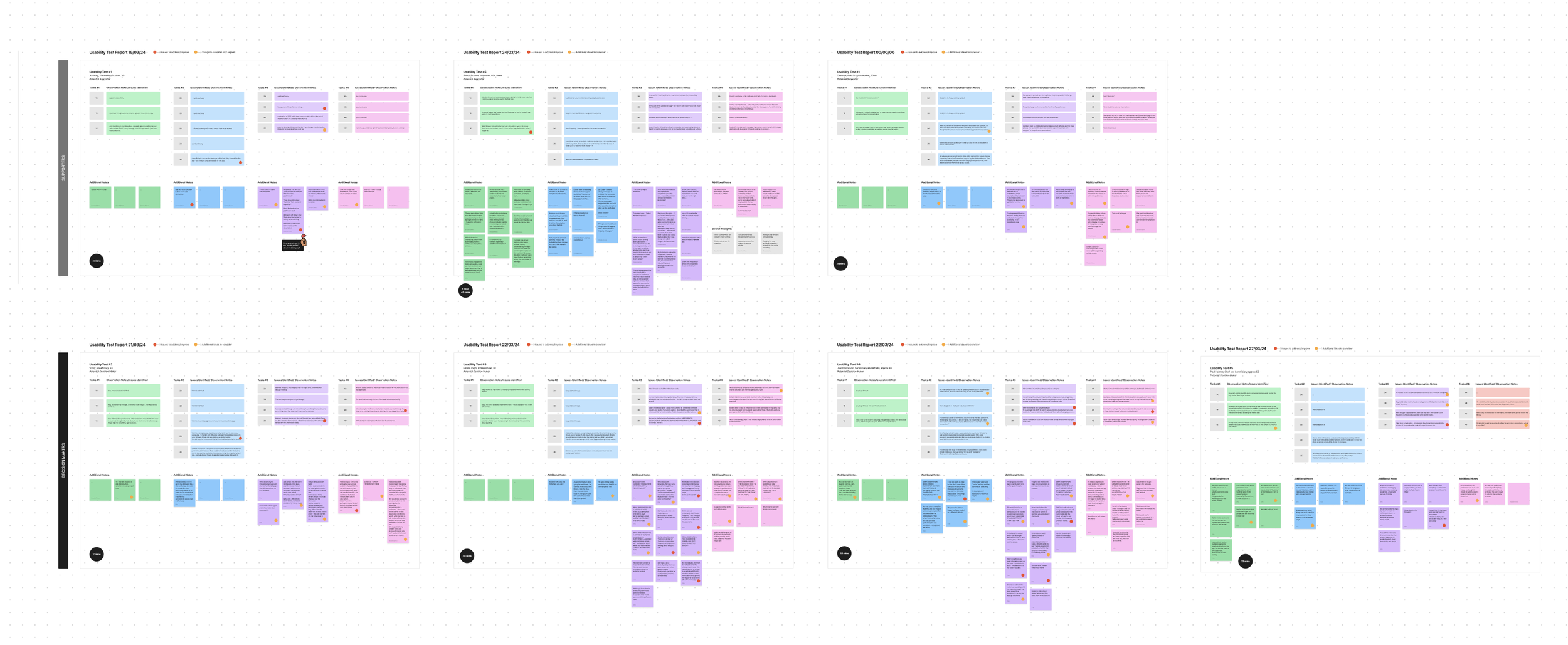
Usability Testing -> Through several rounds of usability testing, the Volition app evolved to deliver an intuitive and accessible experience for decision-makers and their supporters. Initial feedback was largely positive, with users appreciating the core functionality but highlighting areas for improvement, such as the onboarding process being too detailed and navigation between the profile and preferences needing simplification. These insights led to a streamlined onboarding flow with a progress bar and clearer task guidance, making it easier for users to customise their preferences and profiles. Media upload was improved with more feedback during the process, and navigation was made more intuitive by repositioning key buttons like "Add Preference." The final testing round validated these changes, with users completing tasks smoothly, providing positive feedback on the refined interactions, and expressing satisfaction with the app’s overall usability.
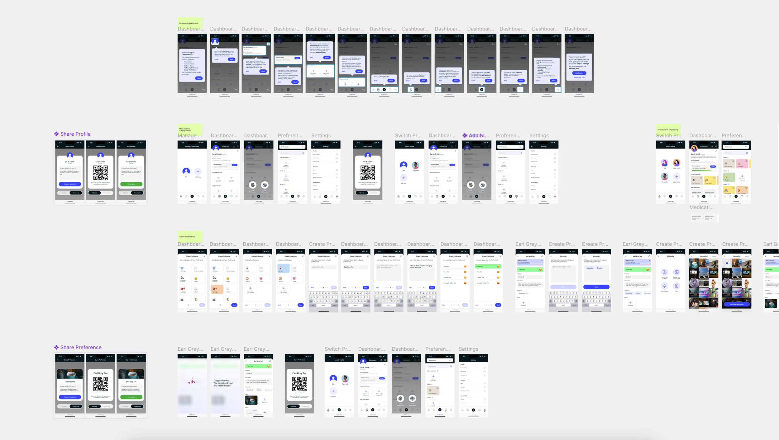
Hifi Wireframes & Prototype Iteration in Progress
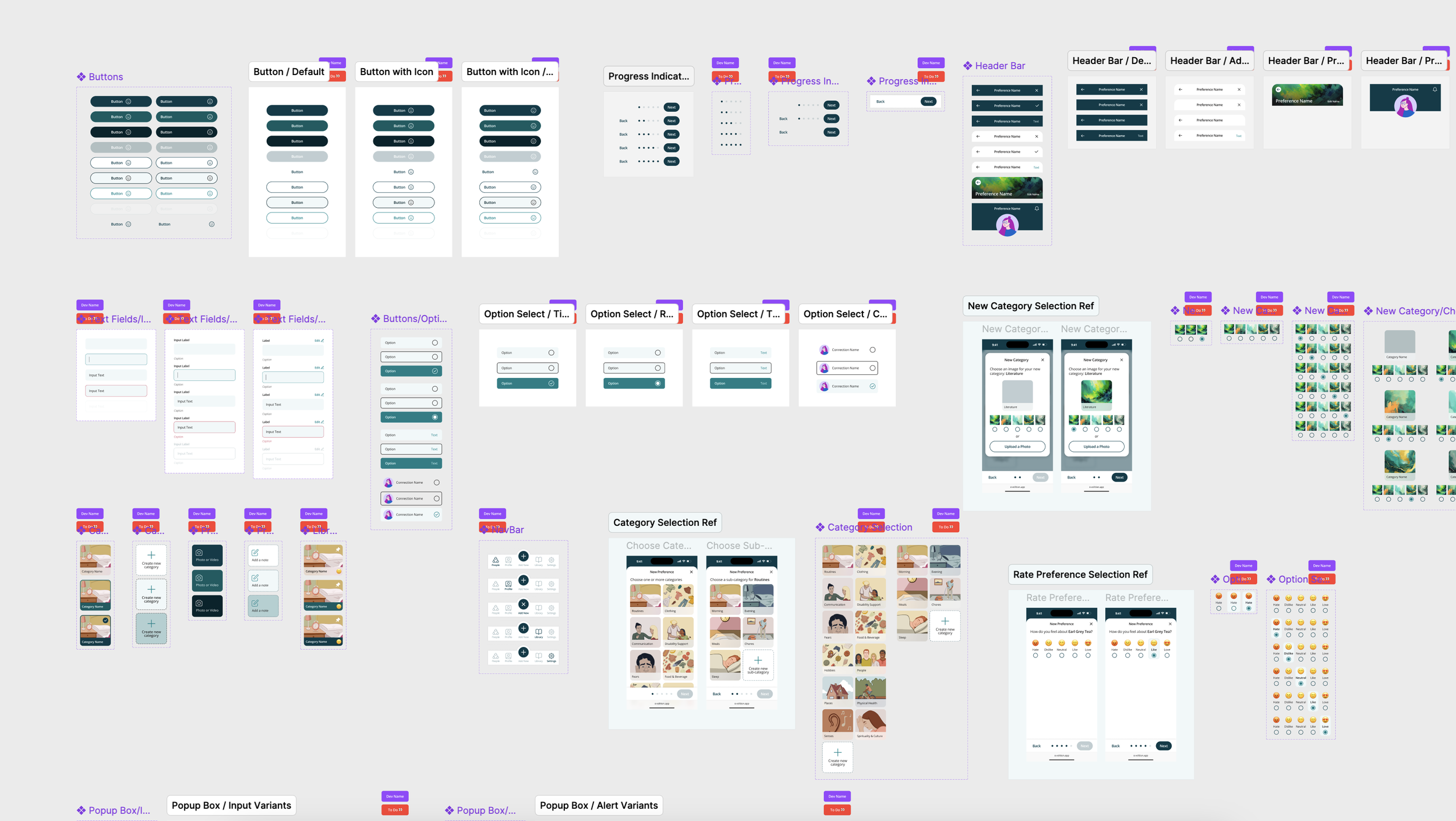
Design System & Component Library -> I built out a design system & component library to standardise UI components, typography, and colour schemes across the app. This system ensured that the app had a cohesive visual identity and that the design could be easily scaled and maintained by the development team.

Final Hifi Designs & Handover -> After several rounds of usability testing, the final high-fidelity designs for the Volition app truly reflected the evolution of an intuitive and accessible experience for both decision-makers and supporters. The streamlined onboarding process, simplified navigation, customised profile and improvements to preference logging and accessibility all came together to create a user-centred solution. By the final testing phase, users were seamlessly completing tasks, and the positive feedback validated the changes we implemented throughout the design process. I worked with the development team to build out the design system, ensuring a smooth transition and laying the foundation for the next phase of development. I’m excited to see how the app will continue to evolve and can’t wait for its release, knowing the groundwork has been set for a crucial, user-centred product that I know is going to have a massive positive impact on the lives of many.